
 Back to Blog
PRESS PLAY - (RE)INTRODUCING OC
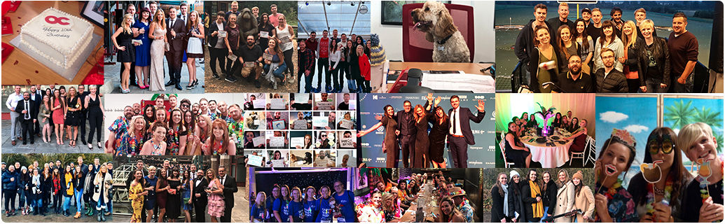
As of late, reasons to celebrate are few and far between, so when one comes along, we need to grab that opportunity by the horns, and let it take us on a joy ride of revelry, positivity and reflection. That’s why when a major milestone for the agency rounded the corner, we seized the chance to look back, look around, and look forward.
It’s 2021, and OC is marking 15 years of serving the entertainment industry as a creative agency. And while the possibilities of our in-person festivities remain up in the air, we knew one way to celebrate was by painting the town, well... not red this time. As part of the wider rebrand, we’ve said farewell to our crimson colour palette, and made way for a spectrum of vibrant and uplifting colours and gradients - a rainbow-like reflection of the agency’s evolution.
But a lick of paint isn’t all the overhaul has involved. As founder and CEO, Alex Carter says, “This rebrand feels like we’re flying a flag - something we’ve not really done up until now. We’ve been quietly going under the radar, producing great work and building long-lasting relationships, but perhaps not taking the time to stop and reflect on ourselves. With the 15 year anniversary here, it seemed like an opportunity to reminisce. It made me realise something that’s important to acknowledge - I’m truly proud of this agency. Because OC was ‘AC’ for so long, I never allowed it to have its own confidence. But now it’s about the wider team - who should absolutely be proud. It’s time for the agency to have its own voice and be its own entity. That’s both the reason for the rebrand, and the brief I gave for it - it had to feel true to the agency we’ve become.”
To really get to grips with why the agency and Alex were so interchangeable, we’ve got to hop in the Delorean/Tardis/hot tub, or your time-travel apparatus of choice, and head back to the year 2000 B.O.C.
Rewind
Barely having left his teens and armed with a love of film, a knowledge of print, and aspirations of being a graphic designer, Alex took tentative steps into the world of distribution. Through his craft and natural curiosity, in his first role as a creative designer of DVD key art and sleeves, Alex began tweaking, finessing and getting to the heart of what made consumers tick. He experimented with swapping out key arts in-store and seeing sales fly as a result. Alex soon became a Creative Director right at the heart of distribution, and at the peak of the DVD boom.
With sales through the proverbial roof, and with his new-found insight and confidence, Alex took the chance to channel the curiosity and entrepreneurialism he’d harnessed, and decided to take his own path, with then-partner, now-wife, Loraine. And that’s when Obviously Creative was formed.
With some initial solid client relationships in place, this small but talented team produced an epic volume of work, becoming the ‘industry secret’ for their clients (who weren’t willing to share). After 4 years, the secret got out. As Alex attended increasing numbers of film market events, Obviously Creative became a go-to agency for independents by ‘creating unstoppable partnerships’. The agency’s roots in creative-thinking shone through and revitalised the business when Alex became fully immersed in the art of printing, becoming closer to the journey to market, and offering his clients even more customer insight and unique solutions.
2015 marked a key turning point. Client partners, Sony and Signature, put Obviously Creative forward for the BVA Supplier of the Year. Despite being grateful for the opportunity, Alex didn’t hold his breath. But, lo and behold, the unexpected win came. “The whole room erupted - people do seem to love an underdog. I took the entire team up on stage to collect that award,” Alex recalls. “It was theirs after all.”
In the years to come, the agency flourished, growing in skills and numbers to become a full-service creative marketing agency, while retaining its boutique edge. 2020 was a landmark year for OC, as the team showed tenacity, adaptability and resilience in the face of a global pandemic, while still taking on some of their biggest and most complex projects to date – just one of the reasons OC was named Creative Agency of the Year at the 2020 BASE Awards. This had truly become an agency that could hold its own, and was uplifted by its founder, rather than being one and the same.
So, there you have it, the rapid rewind of OC’s history. Which neatly brings us back to the present...
Pause
The tape pauses, and flashes of colour glitch across the screen - the revitalised OC launches now.
Our name had long caused internal conflict - the twang of unintentional arrogance that comes from answering “So, where do you work?” with “Obviously!” was causing an identity crisis. The name ‘OC’ had been in our, and our clients’ vernacular for a while, and that’s what we’re going by now. Simple, yet self-assured. Confident, no longer cocky.
With our name in place, we got to work. Befitting of the transformative times we’re living in, the brief evolved and shifted throughout. But, there were several must-haves that remained constant throughout the rebrand journey: the brand’s ability to be fluid and varied, and remaining true to the agency as a whole, including its individual members - now a growing team of over 30.
We’ve picked apart, analysed and stitched the agency back together repeatedly in the last few months, each time uncovering facets and elements that helped us build the bigger picture.
A rebrand is very much like an iceberg - there’s a lot going on under the surface, but it’s the tip poking its restyled, updated head out of the water that will catch attention.
During our great name debate, one concern with ‘OC’ was that it might be visually inescapable from the look of a certain noughties, Californian teen drama. But we stuck to our guns, and produced a logo that’s loaded with one of our favourite things - storytelling. For the geometrically-inclined amongst you, you might recognise that it’s based on a Reuleaux triangle - but we’re calling it the OC Heart. A flat surface can be rolled across this shape, and while it moves and adapts underneath, the surface moves smoothly and consistently... You see where we’re going with this. Inside, the ‘O’ and ‘C’ are equal, balanced and composed, while knotted together with a flowing loop to symbolise the workflow of our full-service creative agency.

Our aforementioned vibrant and diverse colour palette not only reflects the curiosity, playfulness and warmth of the agency as a whole, but also the variety of skill sets and personalities held by its individuals. Inevitably, the swatches are also a sign of the times. “Had it not been for the pandemic, our colour scheme could have been very different,” says Alex. “We felt that it was important to have something to bring us out of the low. We needed it to be feel-good, uplifting, and youthful. And although I’m now 40, the agency is still very much in its youth. Our new brand looks forward to the future. We’re proud of both the agency, and the entertainment sector’s resilience, so we wanted our brand to celebrate that - it’s exciting and optimistic.”
But what does this future that we’re eagerly awaiting have in store?
Fast Forward
COVID has been a catalyst for change - be it on a microcosmic level, with new hobbies and DIY projects galore, or on the global stage. And as we wade out of the depths, we’re sure more and more brands will come out of the other side rebranded and ready to take on the world, post-pandemic. We’re already seeing it in our sector, with NOW TV streamlining to become NOW, giving up its pop art palette for something a little more serious. Outside entertainment, Burger King also shook up their style with their first redesign in 20 years. Harking back to better times with a 60s-inspired look and feel, they went for the nostalgia route – something we suspect we’ll be seeing more of.
“I think it’s easier to rebrand than ever before because of the digital world,” Alex muses. “Consumers are much more open to it, which allows brands now to be less concrete, and more fluid. That’s what I love about our rebrand - it’s got legs to adapt and evolve.”
In the OC sphere, the biggest challenge for the future will be emerging out of lockdown. Like immeasurable numbers of businesses, across a range of industries, we went into the summer of 2020 in survival mode, hoping to come out the other end still kicking. Little did we know we’d thrive, all by tapping into our problem-solving mindset, and our curiosity for tools and technology. The tricky part will be how we continue to build our agency post-COVID - a delicate balancing of individual staff circumstances, client expectations, and the overall needs of the business.
Alex knows the key to this will be something that’s deeply-ingrained in OC’s way of thinking and being. “It’s our values of honesty and transparency. It’s got to be about people at the end of the day. That feels like a given, but it’s true. Understandably, many businesses focus on the money, but I don’t want to put the numbers at the heart of every conversation. As it always has been for me, it’s about good, quality people coming together and delivering results-based creative solutions we can all be proud of. Ultimately, it shows our clients a real honesty about the way we approach things. They understand our values, and those partnerships are a real part of our ethos.”
Play
We’ve looked back, paused and fast-forwarded, and all of that’s been invaluable. But now, we’re eager to resume play. Are you ready to watch with us?

We use cookies to give you the best possible experience on our website. By clicking OK, you agree to our privacy policy.